In yesterday’s blog article, we looked at 50 amazing guerrilla marketing examples. Lets now focus on a single Guerrilla Advertising example and take a closer look at what they did.
The subject of our study is a “Texting can wait” campaign carried our by a car mechanic Erie-LaSalle Body Shop in Chicago, IL. The sponsors of this campaign include the Chicago Fire Department, 100 Club of Chicago, and Chicago Police Department. The campaign is part of a broader initiative – sponsored by AT&T and Verizon.
I’ve noticed the car below parked on the corner of Erie and LaSalle in Chicago on my way to the office one September morning:
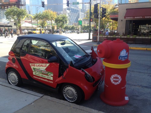
Looks like advertising for the auto mechanic in front of which the Smart pictured above was parked. That would make sense, since that vehicle stood there for months and had a sticker with the logo of the auto shop on both sides. Then why did they add this fake fire hydrant and what’s wrong with the front of the car? Well, no matter – I was driving, so I only had several seconds to consider this odd looking attempt at advertising.
I have been passing this car almost every morning while driving to work, so next time I glanced at it, I figured it must be some some sort of advertising against drunk driving or the car shop wanted to add a little twist to their advertising but why those third-party logos on the side of the hydrant? No matter, I let it go because what’s the point dwelling on the advertising that has logos that are too small to read?
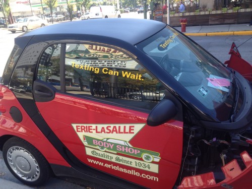
Coincidentally, I was walking by that car today and noticed the following message on the window on both sides of the car:
How do We Measure Success of a Guerrilla Marketing?

It then hit me like a brick – this is an advertisement, or rather a Public Service Announcement (PSA), against texting while driving! My reaction can be seen in the photograph to the right.
If it took me – a marketing officer at a website design company with a Master’s Degree – almost a month to find out the message of this advertising, then we can easily label it as a ‘failed’ campaign. Now lets look at some of the errors they made – not least of all, the fact that they have a Chicago video production company with bucket-load of viral and guerrilla marketing experience – and how could this campaign be salvaged:
1) Placement of the marketing message – the main message is “Texting can wait” which is hard to see, because:
– It is on the window
– The font is too small
– Shop’s logo is much bigger and steals attention from the main message
– Too many different logos to make out the important one!
2) Location of the Smart car – as seen on the picture below, the car is parked on the corner with a busy street – LaSalle (note how closed the car is to the pedestrian crossing in Chicago it is illegal to park “in a manner that impacts pedestrian safety“):
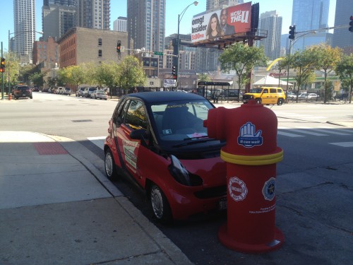
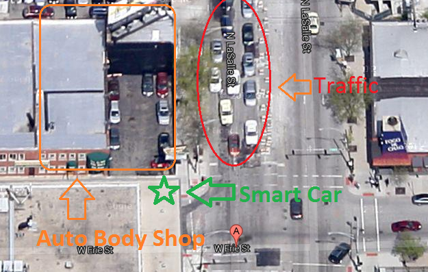
During rush hour, when there is traffic going both ways – not to mention cars constantly moving back and forth from the body shop – the Smart car often BLOCKS TRAFFIC!!! A golden rule of ambush marketing is not to inconvenience people, especially your target audience. In this case this rule has been totally disregarded and I guarantee you if your ad annoys somebody, that person can NOT be counted as a conversion! See map of the placement of this Guerrilla Marketing example – annotated by me, the actual location can be found through Google Maps.
3) Fake props – the Smart car is not really broken, just made to look that way. It is plain to the naked eye that this car is not wrecked, they simply removed some screws and replaced the headlight covers with broken ones. This makes the entire effort look cheap. Think how easily this could have been fixed – they are a car repair shop, so they could use an ACTUAL wrecked car. Moreover, that car wouldn’t have any preexisting stickers, so the marketing message would be very clear.
4) Other logos – the other logos, those on the fake fire hydrant – are also too small. One – 100 Club o Chicago – has a motto included and I actually had to stick my face inches away from it to read what it stated – Providing for the Families of Fallen Police Officers & Firefighters of Cook County. Close-up below:
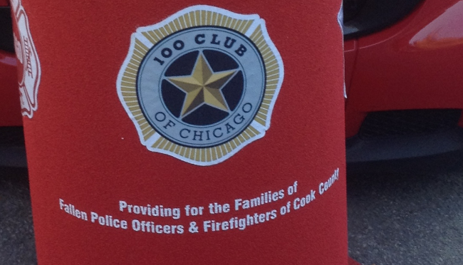
5) Make up your mind what are you advertising – this presentation has logos for the body shop, CPD, CFD, and the 100 Club of Chicago – ALL more visible than the main message of separating texting time from driving time.
6) Location – again location, location, location! The car is right in front of an auto shop full of broken vehicles – with the precise placement, this car looks like another projects waiting to be fixed and I’m sure many people mentally disregarded it as such! Not to mention the car has been there as an ad for the shop for months prior – in the EXACT same spot – once again, not good!
7) Consult with professionals – Guerrilla Marketing requires both a creative mind and experience in marketing – they should have asked for advice and I’m sure any marketer would point out the issues above right away. I don’t try to fix broken cars nor should I be expected to – I market products and services.
Update (05.25.2023):
While the Chicago example is a failed guerilla marketing campaign (or at least a campaign with problems), it has nothing on the Cartoon Network’s Boston Bomb Scare that happened in 2007. In an attempt to promote the animated series Aqua Teen Hunger Force, Cartoon Network placed electronic light-up signs resembling a character from the show in various locations around Boston. However, these signs were mistaken for improvised explosive devices, causing panic and leading to a city-wide bomb scare. The campaign resulted in widespread criticism, legal repercussions, and negative publicity for Cartoon Network.
Now if this is such a failure, why did I even bring this up? Well, I believe in teaching not only through good examples but by using bad ones as well! Hats off to Vincent Flanders of Web Pages That Suck for giving me this idea years ago when I was still a freshman in college. The motto of Vincent’s website is “Learn good web design by looking at bad web design.” I hope you learned something too – I certainly did!
If you know some good examples of failed marketing campaigns, then please share them with everybody in the comment section below – please, remember that the point is to educate, not to ridicule!